Color Theories
Why are elementary schools splattered in primary colors? Why is hospital art that same watered down shade of blue or green? Why does white overhead lighting feel so abusive? (Real recognize real, Mariah.)
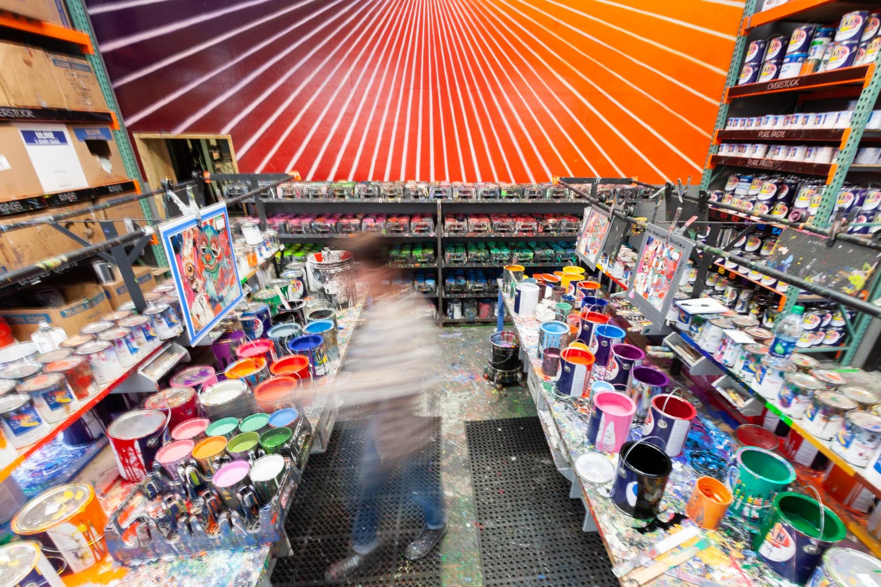
Our prismatic mixing room.
Because color has a psychological effect on how we think, feel, even how we act. No, my scientific reference is not the $4 mood ring I bought at my best friend’s cousin’s yard sale in Massapequa—it’s actual science.
“The review clearly shows that color can carry important meaning and can have an important impact on people’s affect, cognition, and behavior.” That’s what two smartypants psychologists found in 2014 when they used empirical research to test color in, among other things, consumer behavior (yes, McDonald’s chose those golden arches for a reason).
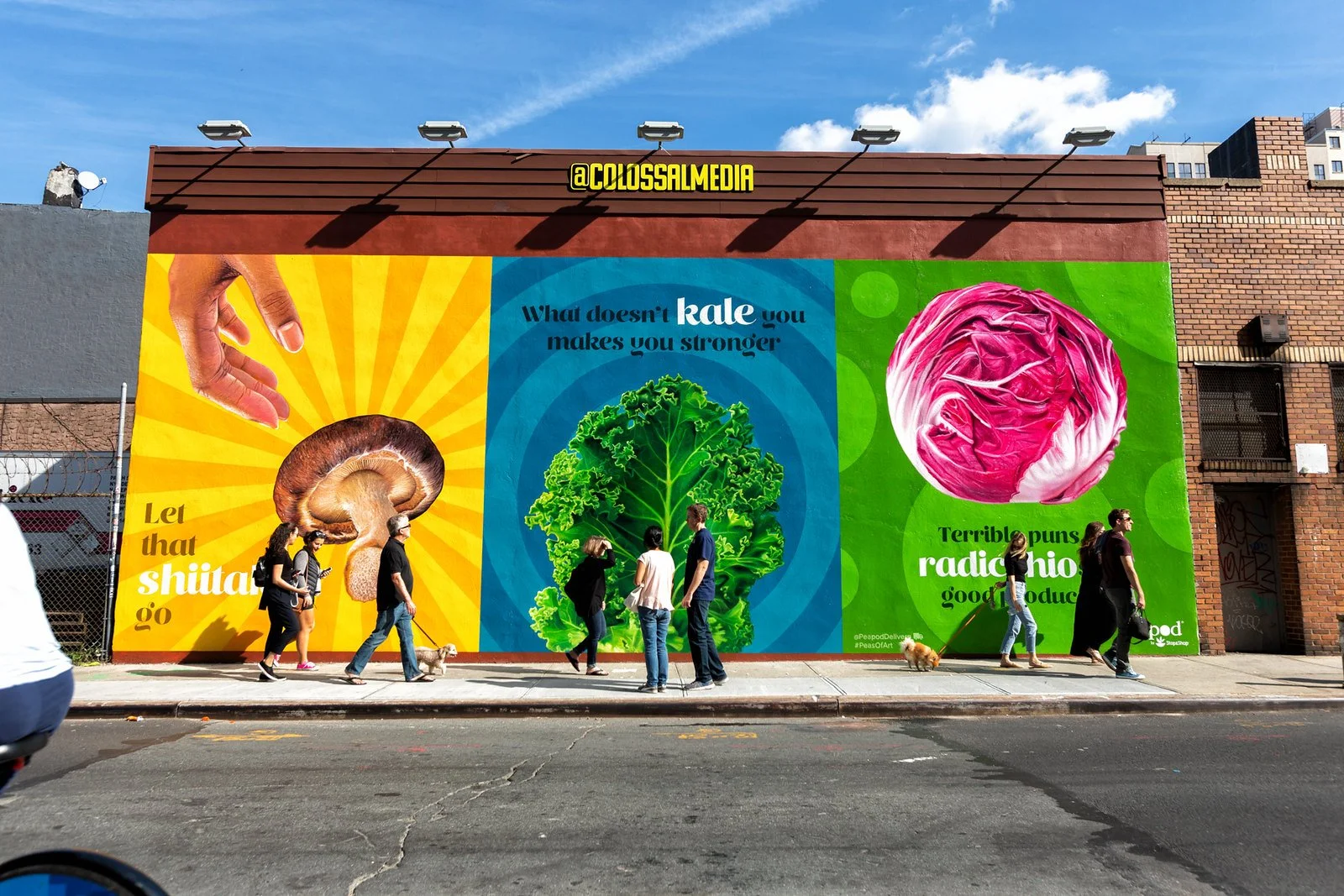
But you probably knew—or felt—these effects before you stumbled upon this essay. I’m sure you’ve been green with envy, filled with red-hot passion, or hit with the blues. Maybe you’ve spent a night sobering up in Drunk-Tank Pink or had a sartorial reckoning when you watched The Devil Wears Prada (“It’s not turquoise. It’s not lapis. It’s cerulean.”). Or maybe you walked past a Colossal wall and saw a big, bold, in-your-face ad that stirred a funny feeling inside. That’s no surprise: Color is a key ingredient to visual arts, and color plays a big role in advertising and marketing (red CTA buttons perform 21% better than green ones, who knew!).
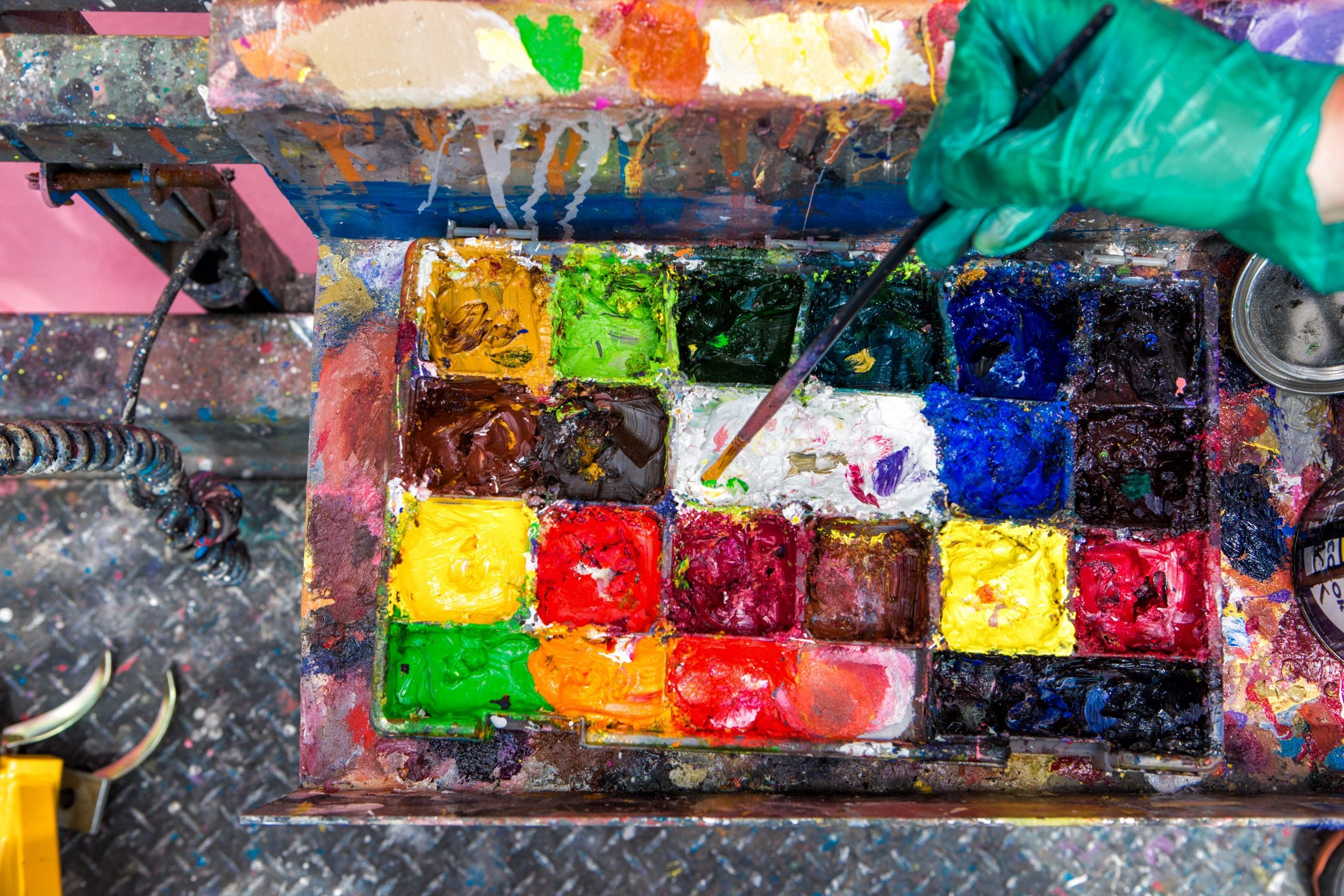
“Color is important for the same reason flavor is important. New experiences help us define ourselves, communities, and cultures.” That’s Liam McWilliams, our VP of Paint and Production. He goes on: “Brands and agencies want to enrich the out-of-home experience, and our process of creating and applying color pulls people into our world and our clients’ worlds. People see something more than a building with a sign on it. They witness the human touch.”
Color is important to our partners, too. Take Pantone, for example. They’re kind of a big deal in this vibrant world we live in, and they’re our go-to colorwheel reference. The folks at Pantone are also known for their clairvoyant Color of the Year project. When it comes to selecting that honorable annual hue, they do more than pull purty swatches out of a hat—they conduct research, turn up their “awareness levels,” and consider how you and I feel.
“We look at quite a variety of influences,” Leatrice Eiseman, Executive Director of Pantone, told me, “as diverse as the worlds of entertainment and art, many sectors of design, fashion, cyclical trends, socioeconomic indicators, lifestyles and playstyles, relevant social media platforms and technology.”
Kinda makes you wonder: What does Pantone 19-4052 Classic Blue, the 2020 Color of Year, say about the wind-whipped misadventure that’s been the past 226 days? Matter of fact, what will the 2021 Color of the Year, to be announced sometime this winter, forecast for the coming calendar??
Leatrice offers some reassurance: “Most importantly, we pay close attention to peoples’ needs, aspirations, concerns, and hopes in finding the best color to embrace and express all of the influences and emotions mentioned.”
Color has a profound say in daily life—it inspires feeling and action, poetry and dance, art and advertising. It’s the brilliance people write home about. The enchantment people write songs about. The wonder we’re awash in everyday. Hey, humankind has gone as far as assigning a color to an entire generation;—we’re about this life.
From the food we eat (would you drink blue tomato juice?) to the clothes we buy (sorry, white after Labor Day) to the marketing we engage, color has a powerful say in how we think, feel, and behave. The proof is in the pudding—which must be brown because nobody’s gonna eat red chocolate pudding.


