
Fresh Coat — The Story Behind Our Shop Repaint
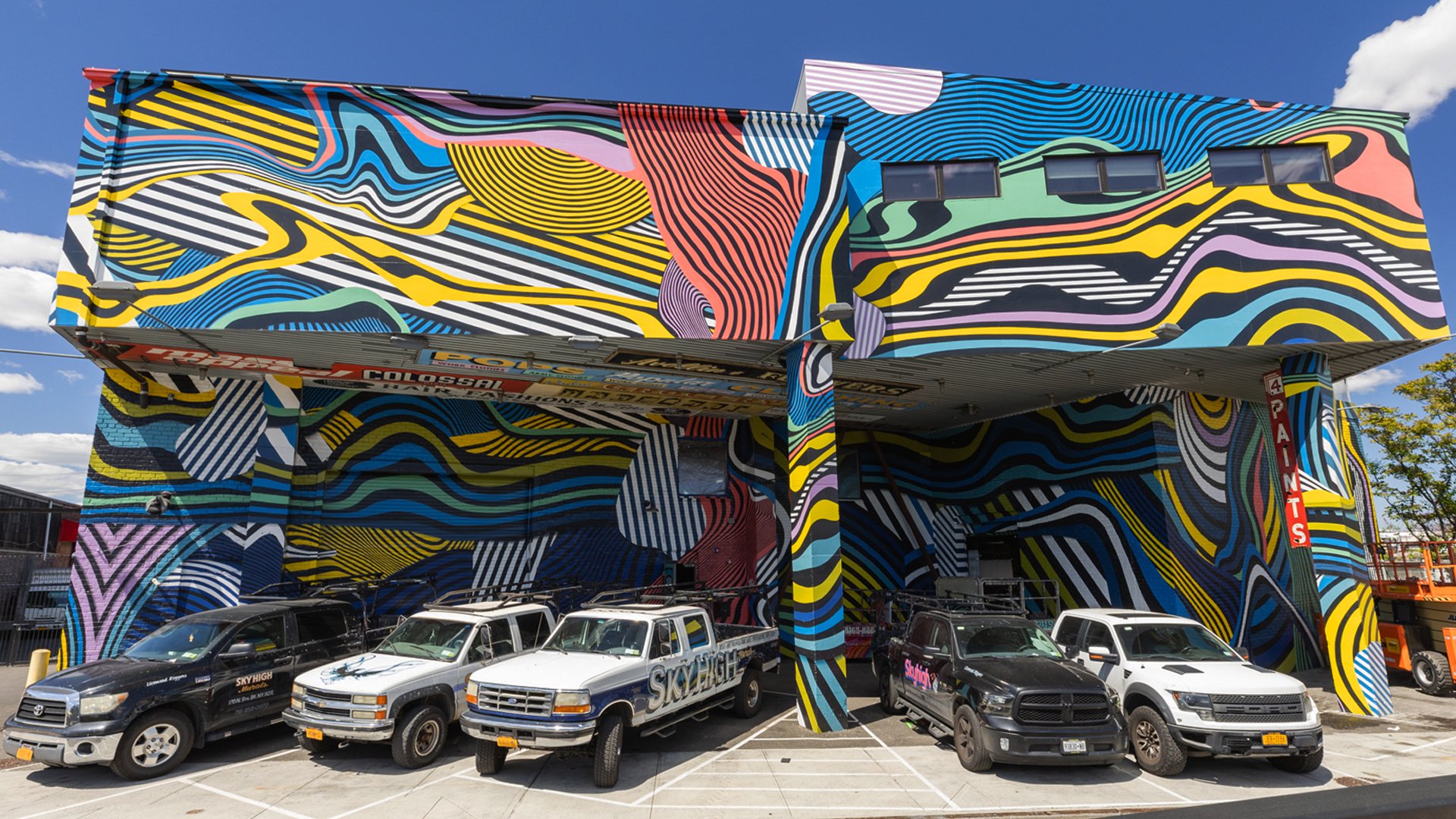
With nearly 20 years on the wall, we’ve painted thousands of public art murals for media, commercial, and community-oriented clients. Occasionally, we’ll also wield our brushes to beautify our workspace. Seven years of one shop design in Brooklyn and Los Angeles is a good run, but the paint had started to fade and chip. So we tasked ourselves with reimagining our space in 2023.
Inside the shop walls is where all of the pre-production magic happens. The artwork you send us, gets digitally drawn, burned into a pattern and ready for pouncing before our team starts painting. If these words made zero sense, check out our People Who Pattern post in Field Notes to see how your artwork goes from a hi-res image file to a photorealistic, hand-painted work of art.
We encourage you to come see the fresh paint for yourself. Take a tour of our shops where all the mural-making magic happens.

All that said, here’s what our creative, paint and operations teams had to say about giving our NY and LA shops a fresh new look.
Why was it time to repaint the shops in NY and LA?
John Samels (Creative Director): The old murals were weathered and starting to chip in NY and LA, so it was time for a redesign. Conceptually, we wanted to re-introduce ourselves as the new Colossal – the one who has invested in hand paint by expanding our apprenticeship program and opportunities for creatives to learn the craft of hand-painted advertising.
Liam McWilliams (SVP, Operations): I think it’s important to ever change and be self reflective and trying new things. For this in particular, the shops were painted six or seven years ago and the paint that we use does have an actual life before the chroma starts to fall off and the gloss starts to fade. It’s usually around five years. So we were a little bit into the flaky faded period of the mural. So just in general, it needed a new coat.

What was the inspiration for the design of the repaints?
John Samels: We were asked to design something where the bulk of the work could be done by apprentices. In essence they’d get to paint their new home, so simple line work was key. We gave it a psychedelic filter of geometric shapes. A lot of the color scheme is inspired by our paint shops and the colors you see from old signage we’ve hand painted over the years.
Hartwick Hanson (Senior Designer): With our goals in mind, I presented the idea of dazzle tease. Before radars and tech, warships would use dazzle camouflage. It’s basically a bunch of contrasting colors and lines that abstractly intersect. I find it fascinating that there was a brief period of time where they figured out countermeasures that didn’t require technology that happened to also look incredible – usually war and aesthetics don’t come hand in hand. I think they’re quite beautiful, but the point of dazzle tease was to break up the silhouette of a warship so other ships couldn’t accurately gauge the distance or direction the ship was traveling, making it harder to shoot at them. This pattern inspiration is one that I’ve pitched for client work millions of times, so it’s exciting to see it come to life.

Submarine commander's periscope view of a merchant ship in dazzle camouflage (left) and the same ship uncamouflaged (right), Wikicommons.

Colossal Studios 2023 shop repaint design file.
How did you land on a color scheme for the redesign?
John Samels: We tried to stick to more traditional dazzle camouflage where it was like black and white stripes and then we tried yellow and black which are our brand colors. It was all really nice, but it just felt like it needed more. So we decided to pick out some additional colors and run it through a psychedelic Colossal filter. What came out was this chaos of organic and somewhat geometric shapes weaving in and out of each other. We went through so many iterations of it and added more color with each one. A lot of the color scheme is inspired by the shops, walking through the space and seeing the old signs we’ve painted over the years and how the colors on those signs have weathered.
Hartwick Hanson: Other buildings don’t look anything like this. I’ve never seen other buildings covered in crazy stripes before. I like the colors we came up with. We used more muted colors since the design is so theatric. There’s this mix of intensity and elegance.

When folks are flying over New York or Los Angeles, or approaching the shops from a distance, what do you hope they see and feel?
Matt Wright (Senior Director, Production): Honestly, I don’t care what anyone else thinks when they see it, but when people see the shop, I hope that they know how much we appreciate our paint team and that the artwork was designed with them in mind for opportunities for them to paint things that they can lead. That was the most important thing for me and the thing I’m most excited about is getting them opportunities to paint.
Christophe Michel (Painter): We feel the unity of something built. The lines are pretty well joined. For me it shows the unity of Colossal.
Jessie Jones (Painter): You just want it to definitely catch people’s attention and really draw them in. You know you don’t know them to crash with cars while they're driving, but you want to really stand out and make your presence known. And I think that’s what’s really cool about our shop being painted. The crazy lines and everything really make the whole building kind of flat with the way we’re able to transfer the lines from over the corners pretty seamlessly, so I think that’s a really cool aspect about the building.
John Samels: I hope they’re thinking: Wow there’s probably something really cool happening in that building.
Hartwick Hanson: You know how when you’re driving at night and you have that brief moment of like, What am I looking at? I think that would be pretty cool. If people go: Is that a building? Is there a tarp hanging over it? And then realize, Oh they painted it. It’s that moment where you realize you’re not just looking at another warehouse down there. It stands on its own, but it’s not wildly out of place.
Liam McWilliams: I always describe our shops as a sign painter’s fever dreams because it is a maximalist style where there’s a lot going on. There’s a lot of retired signage hanging on the walls, a lot of workshops – past and present – that are shining through equipment. The way the exteriors were painted previously it was like a Where’s Waldo type of design. With this iteration, although it’s a little bit less crazy, it is still very intricate and detailed with different line weights, different textures and patterns and drop shadows. One of the goals is that people see something new each time they show up, right? If the building was a solid color, there’s still an interesting nature to the shape of it, but when the mural that wraps the outside has all these different levels and different details, it makes it a little bit more interesting each day throughout the seasons to see something new. It also makes it easier for the cab driver to know where to go.


What was the process for painting these unique building structures?
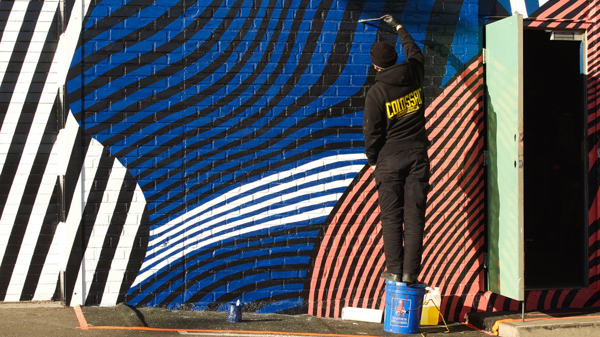
Liam McWilliams: What we try to do for all walls, but in particular, what we call production jobs or things with extra variables is to solve as many of those problems as we can before we show up to paint. There was a heavy focus on pre-production – measuring the square footage to know how much paint is needed, figuring out the actual skeleton of the shop, so that way the patterns can be correct so that they line up. Ordering the right lifts. When we actually got on-site, we had to remove hardware, lights and other obstructions to paint. So a lot of that problem solving and a lot of thinking through it and trying to address those variables happen on the front end.” We also had a lot of client walls in production that needed our advanced and expert painter ranks. This then gave other ranking painters the chance to lead a job. Maybe not the entire shop buildings, but different sections of it, so different walls broken into different teams. So that allowed for opportunities for people who are kind of new to the leadership role, getting a chance to shine and practice with a bit of a safety net. That safety net allowed people to step into the leadership position without the stress of looming post-date deadlines for clients.
Matt Wright: For the shop repaint, we didn’t rig at all. Everything was done with scissor lifts. There were a lot of hard-to-reach spots for painters, but they made sure they were set up to reach every part of the building.


How did it feel to work on this repaint?
Jessie Jones: It was a good experience. It allowed me to get more familiar with brushes and just figure out soft-hair brushes versus stiff-hair on certain walls and how that can translate when I go into the field more often. So that was cool for me.
Christophe Michel: It was also good training for easier walls. The walls we have at the shop are pretty rough, so it was pretty difficult to avoid dripping and etcetera, but it was a really good training for everybody. Everything seems easier to paint for clients now that we’ve painted the shop.
John Samels: The repaint was something that needed to be done and it was a nice opportunity to switch it up. Hopefully we can make this a space where newer classes coming through the apprenticeship feel pride and ownership of where they work. You know, the intention is not for this to be up for 7 years like the last one. This is sort of like the dawning of a new time at Colossal, so hopefully the shop repaints can grow and change with us as Colossal continues to grow and evolve.


Any final thoughts you want to share on the shop repaints at Colossal?
John Samels: Where the NY shop ends in design, the LA shop picks up. We love having this bi-coastal shop paint synergy on such a large scale creative project.
Liam McWilliams: A fresh coat of paint does a lot of good. It helps show progress and change and is part of setting new goals and new generations of painters, and it’s just great to see it and it’s great to watch the evolution of the craft.

This interview has been edited for brevity and clarity. Thank you to Marco Ortiz for providing the drone footage that made this video possible. To learn more about shop tour opportunities, email us at info@colossalmediagroup.com.